The following was originally published in The Hub.
In the early days of managing the Johns Hopkins COVID-19 dashboard, experts at the university and those at Esri, the company providing the mapping software for the real-time pandemic tracker, had a friendly rivalry.
“They would tell us, ‘Oh, your COVID map is big, but not as big as our Pokémon Go map,’ which was their most in demand,” says Reina Murray, an application administrator at JHU’s Sheridan Libraries.
By March, the volume of web traffic to the Hopkins map effectively shut down that conversation—the Hopkins dashboard now holds the record as Esri’s highest-used service of all time, drawing hundreds of millions of feature requests every day. At a peak in March, the dashboard saw 4.56 billion feature requests.
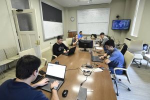
For Johns Hopkins, the dashboard has been a groundbreaking endeavor, pooling the collaborative energy of specialists across the university—software developers, systems engineers, data scientists, mapping experts, digital curators—who may never have crossed paths otherwise but now coordinate shifts around the clock and keep in touch constantly through Zoom and Slack.
“We’re all one big happy Blue Jay family, working together to answer a set of key questions, globally and domestically, around the progression of this virus,” says Aaron Katz, supervisor of the large-scale analytic systems group at the Applied Physics Laboratory.
Katz’s team at APL typically works with complex datasets for large government projects, in areas like global health security. The team from Sheridan Libraries supports data-intensive scholarship: collecting, sharing, visualizing, and preserving digital research and collections, spanning areas from humanities to engineering. For the COVID-19 project, many of these experts have rearranged their work—if not entirely tilted their careers—around the shared behemoth, gathering coronavirus data from across the globe and presenting it to the public.
The larger project also now includes a U.S. map following the pandemic down to the county level, and an array of data visualizations from JHU’s Centers for Civic Impact, tracing trends like racial disparities and policy impacts from the virus. The project is supported by funding from the Bloomberg Philanthropies and the Stavros Niarchos Foundation.
“If you want to produce something of this kind of high quality and integrity, it really does take a lot of people,” says Sayeed Choudhury, associate dean for research data management at the Sheridan Libraries, which supports software logistics for the dashboard.
The original global map—developed by Lauren Gardner and PhD student Ensheng “Frank” Dong of JHU’s Center for Systems Science and Engineering—went viral almost as soon as it launched on Jan. 22. Dong constructed the dashboard using Esri’s ArcGIS mapping platform, at first entering data manually. That quickly proved unsustainable as coronavirus cases spilled out of mainland China onto every continent.
The APL team came on board to streamline the data-entry process. “We’ve built an automated infrastructure that goes out and pulls the coronavirus data from around the globe,” Katz says.
APL’s system now collects confirmed reports of coronavirus cases and deaths from nearly 200 data sources, including the World Health Organization and international and local health agencies. For the U.S. map, the system draws from state- and county-level reports, and sometimes local news outlets that supply machine-readable data.
A number of team members from the different divisions vet those data sources before they’re integrated into the system. “A lot of time and energy goes into finding the right data sources, assessing their validity, and creating ways to harmonize them with our system and present them to the public,” Choudhury says.
APL’s software platform processes the data in near real time, as soon as sources post it on their own websites. Anomalies do arise, but the system is designed to catch them. “We’re able to spot large discrepancies,” says Tamara Goyea, an APL senior data scientist. “For example, if a state reports 20 deaths one day and the next day two deaths, our system flags that and we look into it.”
A small team at the Sheridan Libraries, including Murray and Choudhury, works to support this massive data infrastructure, which includes managing the ongoing relationship with Esri. Hopkins researchers have used the company’s ArcGIS tools for years for a range of internal projects—tracking everything from Baltimore food deserts to Frederick Douglass’ travels—but the COVID-19 dashboard brought the software into a public realm of unprecedented scale.
While absorbed with time-consuming minutiae behind the scenes of the dashboard, the team members never lose sight of their larger mission: providing a critical public service during a global health crisis, one that informs research, policymaking, and individual decisions. The Hopkins dashboard has become a ubiquitous and trusted reference point, cited by U.S. federal agencies and major news sources including The Washington Post and The Wall Street Journal. The National Science Foundation awarded $200,000 to the effort in April, and recently Esri honored the project with its “Making a Difference” award. For her role, Gardner was named one of the 100 most influential people in the world by TIME magazine.
“This is the most impactful work that I’ve participated in to date,” Goyea says. “That’s what drives the team—we’re trying to provide information about a pandemic that’s affecting so many people in so many areas. For us to contribute some kind of understanding, and help with some kind of decision making, that’s our whole objective.”
Everyone involved acknowledges that the dashboard numbers provide a partial picture of the pandemic’s true reach, given unknowns from cases that are asymptomatic, unreported, or untested.
“We can’t tell you exactly how many cases there are in the state of Maryland right now, but we can tell exactly you what the state of Maryland is reporting,” Katz says. “We are bound by the accuracy of our reporting sources, and we do our absolute best to vet those sources and do quality control.”
Ten years from now, Katz imagines, “we’ll see all the reports and retrospectives that will tell us exactly what happened and where” with the pandemic. But for now, he says, “we’re trying to solve this problem of situational awareness in the present moment.”